Kraftwerk stands as one of the most influential acts in the history of electronic music, a group whose innovations laid the foundation for genres ranging from techno to synth-pop and hip-hop. Emerging in the 1970s from Düsseldorf, Germany, Kraftwerk redefined the possibilities of music by fusing experimental soundscapes with the precision of emerging electronic technology. Their groundbreaking work on albums like Autobahn, The Man-Machine, and Computer World established a new sonic frontier that resonated with both underground movements and mainstream audiences.
But Kraftwerk’s innovation wasn’t confined to their music. Just as striking was their meticulously crafted visual identity, which mirrored their machine-like sound and conceptual depth. By presenting themselves as robots clad in stark uniforms or lifeless mannequins, they blurred the line between man and machine, creating an aesthetic as groundbreaking as their music. Their minimalist approach to album art, stage design, and overall branding became a defining characteristic of their artistry.
The Genesis of Kraftwerk’s Visual Identity
Kraftwerk’s distinctive visual identity began to take shape in the early 1970s, paralleling their transition from experimental rock to a pioneering electronic sound. In their formative years, the group’s aesthetic was rooted in the cultural and artistic movements that surrounded them in post-war Germany. This period, marked by a desire to redefine modernity, deeply influenced Kraftwerk’s minimalist and mechanical approach to their image.
Bauhaus Design
One of the primary influences on their visual style was Bauhaus, the iconic design school that emphasized functionality, clean lines, and the integration of art with technology. This philosophy resonated with Kraftwerk’s desire to strip away excess and focus on simplicity and utility. The stark, geometric album covers of Autobahn and The Man-Machine reflected this Bauhaus-inspired aesthetic, prioritizing form and clarity over ornate detail.
Industrial design also played a significant role. Living in Düsseldorf, a hub of post-industrial modernity, Kraftwerk absorbed the mechanical aesthetics of factories, machinery, and the burgeoning technological landscape. This fascination translated into their robotic personas and their vision of music as a product of human-machine synergy.
Futurism
Futurism, with its celebration of technology and the machine age, provided another critical layer of inspiration. The movement’s bold embrace of modernity and its rejection of traditional forms aligned with Kraftwerk’s ambition to create something entirely new—both sonically and visually. The group’s fascination with themes of automation and cybernetics, especially evident in The Man-Machine, owes much to this avant-garde ideology.
The pivotal moment in Kraftwerk’s visual evolution came as they shifted from their early, krautrock-oriented releases to a fully realized minimalist ethos. With the release of Autobahn in 1974, the band began to present themselves not just as musicians, but as artists creating a total experience—one in which visuals and sound were inextricably linked. This transformation reached its peak with The Man-Machine (1978), where the group’s robotic imagery and color-coordinated uniforms became their defining trademark.
The Robots: A Symbol of the Machine Age
Kraftwerk’s adoption of robotic personas stands as one of the most iconic elements of their visual identity, a deliberate move that blurred the boundaries between human and machine. By presenting themselves as lifeless, mechanical figures, Kraftwerk challenged traditional notions of performance and personhood, aligning their image with the technological themes that defined their music.
The Robot
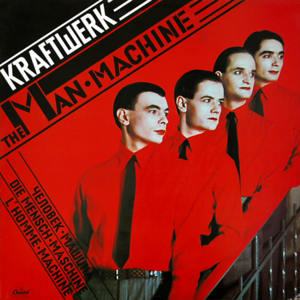
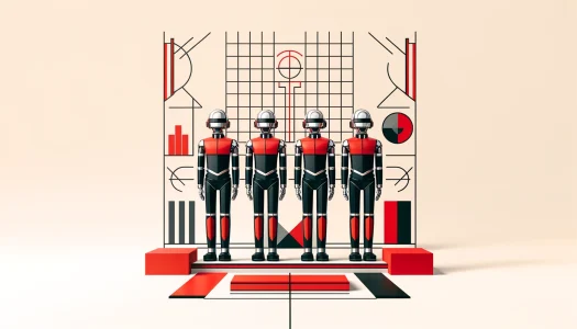
The concept of the “robot” began to emerge prominently during the The Man-Machine era in 1978, when the group fully embraced their transformation into machine-like entities. The album’s artwork—featuring the band in angular, red-and-black uniforms reminiscent of Soviet Constructivist designs—set the tone for this new phase. Their live performances began to incorporate life-sized mannequins that mimicked their movements, and later, pre-programmed robotic replicas that performed onstage in place of the band members themselves. This subversion of the performer-audience dynamic reinforced Kraftwerk’s central theme: the convergence of humanity and technology.
In their music, the robotic personas took on even greater significance. Tracks like “The Robots” and “The Man-Machine” explicitly explored the fusion of human labor and mechanical precision, with lyrics and synthesized voices reinforcing the idea of musicians as extensions of their machines. The band’s synchronized movements, identical attire, and detached demeanor underscored this narrative, transforming each performance into an almost factory-like production.
Societal Themes
Kraftwerk’s robotic imagery was more than just a gimmick; it reflected broader societal themes of their time. During the late 20th century, rapid advancements in automation, computing, and industrial processes were reshaping the workforce and redefining human interaction with technology. By embodying the robot, Kraftwerk became a mirror to these changes, exploring the loss of individuality in an increasingly mechanized world while celebrating the precision and efficiency of modern technology.
The robot persona also served as a critique of the music industry itself, subverting the cult of personality that defined rock and pop stardom. By stripping themselves of human characteristics, Kraftwerk shifted the focus from the individual artist to the collective experience of their art. This radical approach not only reinforced their futuristic aesthetic but also set them apart as visionaries, paving the way for later artists who would adopt anonymity and alter-egos as part of their creative personas.
Minimalism in Design

Kraftwerk’s minimalist design philosophy was a cornerstone of their visual identity, reflecting the precision and clarity of their music. From album artwork to stage design, the band embraced simplicity and functionality, stripping away unnecessary elements to focus on the essence of their creative vision.
Album Covers
Their album covers exemplify this approach, often featuring bold geometric forms and restrained color palettes. The artwork for Autobahn (1974) employs a stylized image of a highway, rendered with clean lines and a sense of modernity. Similarly, The Man-Machine (1978) uses a striking combination of red, black, and white, inspired by the Constructivist art movement. These visuals not only communicated a futuristic aesthetic but also reinforced Kraftwerk’s thematic focus on technology, urbanism, and automation. The use of simplicity and symmetry on their covers mirrored the structured, repetitive patterns of their music, creating a seamless connection between sound and image.
Stage Shows
On stage, Kraftwerk’s minimalist ethos was equally pronounced. The band performed in uniform costumes, often color-coordinated suits or monochromatic outfits that emphasized their collective identity over individual personalities. This uniformity extended to their movements, which were often synchronized to the rhythm of their music, evoking the precision of machines. Lighting played a key role in their stage design, with stark, focused beams creating a clinical and futuristic atmosphere. The overall effect was one of calculated simplicity, ensuring that every visual element served to enhance the music without distracting from it.
Symmetry
Symmetry was another hallmark of Kraftwerk’s minimalism. Whether in the arrangement of their instruments on stage or the placement of the band members, every detail was carefully balanced to create a sense of order and harmony. This meticulous approach resonated with their sound, which was characterized by repetitive, loop-based structures and a deliberate, machine-like tempo.
Minimalism was more than an aesthetic choice for Kraftwerk—it was an extension of their ethos. By paring down their visual elements to their core, they mirrored the streamlined, efficient nature of their music. This alignment of form and function was central to their brand, reinforcing the idea that simplicity could be as powerful as complexity. It also allowed Kraftwerk to stand apart from the extravagance of 1970s rock and pop, establishing them as pioneers not just in electronic music, but in the art of minimalist design.
Multimedia Integration: Merging Sound, Vision, and Technology
Kraftwerk’s artistry went far beyond sound, encompassing a fully realized multimedia experience that integrated visuals, technology, and performance. They pioneered the concept of electronic music as a sensory journey, merging cutting-edge visuals with their futuristic sound to create a cohesive and immersive brand.
In their live concerts, Kraftwerk made innovative use of video projections and synchronized animations, transforming the stage into a canvas for their thematic explorations. These visuals often featured geometric shapes, digital landscapes, and looping imagery that mirrored the repetitive, mechanized patterns of their music. For instance, during performances of Autobahn, highway scenes and synchronized graphics underscored the song’s depiction of a driving experience. Similarly, The Robots saw the band replaced by lifelike mannequins or animated robots, blurring the line between reality and artifice. This integration of visuals and sound enhanced the storytelling aspect of their music, making each performance an audiovisual spectacle.
Music Videos
Music videos were another extension of Kraftwerk’s visual identity, serving as a platform to further explore their robotic and minimalist aesthetic. Videos like “The Robots” featured the band’s iconic doppelgangers moving in perfect sync, underscoring themes of automation and uniformity. In “Computer World,” digital graphics and pixelated imagery reflected the rise of computing and its impact on modern life. These videos, much like their live performances, weren’t merely promotional tools—they were artistic statements that deepened the conceptual narrative of their albums.
Kraftwerk’s holistic approach to branding reshaped how electronic music was perceived, positioning it as a complete sensory experience rather than just a genre. By integrating sound and vision so seamlessly, they elevated the act of listening into an event that engaged multiple senses. This approach influenced countless artists and electronic music producers, who drew on Kraftwerk’s example to craft their own multimedia performances and visual identities. The idea of music as a multimedia art form—common in today’s festival culture and virtual reality experiences—owes much to Kraftwerk’s innovations.
The Enduring Power of Simplicity
Kraftwerk’s visual identity was a masterclass in how simplicity can amplify a message. By distilling their imagery to its core elements—robots, minimalism, and clean design—they created a visual language that perfectly mirrored the precision and innovation of their music. This synergy between sound and image allowed them to communicate complex themes of technology, futurism, and humanity’s evolving relationship with machines with clarity and impact.
The strength of Kraftwerk’s approach lay in its cohesiveness. Every aspect of their presentation, from album artwork to stage design, was carefully aligned with their music, ensuring a seamless artistic experience. Their robotic personas and minimalist aesthetics weren’t just adornments; they were integral to their storytelling, blurring the boundaries between artist, machine, and art itself. This unity of sound and vision set a standard for electronic music and redefined how artists could craft a compelling, immersive brand.
