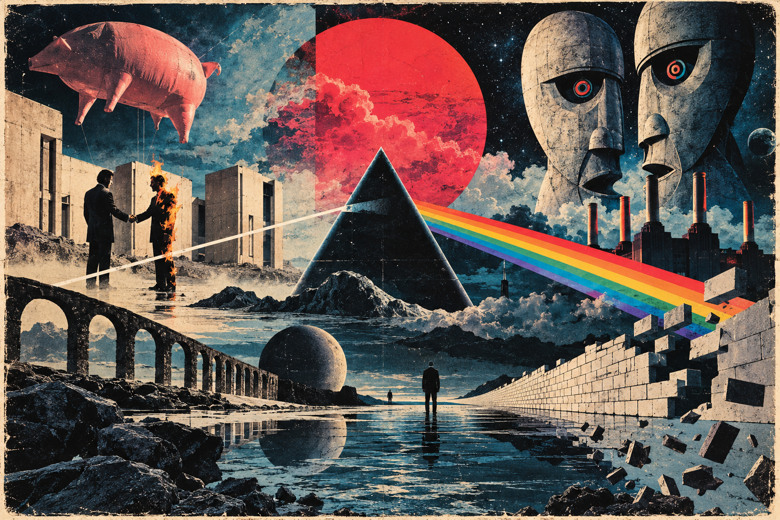
Few bands have created a visual identity as distinctive as Pink Floyd. A beam of light passing through a prism, a burning businessman shaking hands, or an inflatable pig floating above Battersea Power Station can evoke their music without a single note being played. These images have become inseparable from the band’s identity, yet the stories behind their creation are often just as fascinating as the artwork itself.
For Pink Floyd, visual art was never simply a matter of making an album look attractive. As their music developed from psychedelic experimentation into ambitious conceptual works, the imagery surrounding it became increasingly important. Album sleeves offered mysterious interpretations of the music, while concerts transformed abstract ideas into elaborate experiences involving light, film and theatrical design.
Much of this identity emerged through collaborations with artists who approached rock music from unusual perspectives. Storm Thorgerson, Aubrey Powell and their design studio Hipgnosis produced surreal images that often raised more questions than they answered, while Gerald Scarfe brought a disturbing, satirical intensity to The Wall.
But what made these images so effective, and how did Pink Floyd’s collaborations with visual artists help transform the relationship between music, design and performance?
The Making of Pink Floyd’s Visual Identity
Pink Floyd’s relationship with visual art began long before their album covers became cultural landmarks. During the mid-1960s, the band emerged from a London underground scene in which music, experimental film and psychedelic imagery were becoming increasingly intertwined.
At venues such as the UFO Club, their extended instrumental performances were accompanied by coloured lights, liquid projections and shifting patterns. These effects were often improvised, responding to the atmosphere of the music rather than following a carefully rehearsed sequence.
The musicians were not necessarily the centre of attention. Surrounded by moving light and abstract imagery, they became part of a larger experience in which sound and vision interacted.
This approach was reflected in the cover of their debut album, The Piper at the Gates of Dawn (1967). Photographed by Vic Singh using a prism lens, the artwork presented multiple overlapping images of the band, capturing the vibrant, disorientating aesthetic of the psychedelic era.
It was a striking introduction, but Pink Floyd’s subsequent artwork would become increasingly detached from conventional band photography.
The Arrival of Hipgnosis
A significant turning point came with A Saucerful of Secrets in 1968, when Pink Floyd began their long association with the design partnership Hipgnosis.
Founded by Storm Thorgerson and Aubrey Powell, Hipgnosis approached album artwork with an interest in photography, surrealism and visual experimentation. Thorgerson already knew Syd Barrett and Roger Waters from their Cambridge schooldays, giving the designers a personal connection to the band.
For A Saucerful of Secrets, Hipgnosis created a densely layered collage incorporating cosmic imagery, illustrations and psychedelic patterns. A photograph of the musicians appeared within the composition, but it was no longer the sleeve’s defining feature.
The partnership developed as Pink Floyd’s musical ambitions expanded. By the early 1970s, Hipgnosis was moving towards increasingly deliberate photographic concepts, often placing familiar objects in unexpected situations or presenting images that seemed impossible despite their realistic appearance.
This suited a band whose music was becoming more concerned with abstract and psychological themes. Alienation, absence, pressure and the passage of time were difficult subjects to illustrate directly, but they could be suggested through carefully constructed imagery.
Rather than establishing a consistent visual style, Pink Floyd and Hipgnosis developed a shared willingness to experiment. An album cover could be mysterious, unsettling or deceptively simple, provided the image was compelling enough to stand on its own.
That freedom would produce some of the most recognisable record sleeves in popular music.
Album Covers That Became Cultural Icons
Pink Floyd’s most celebrated album covers range from minimalist graphic design to elaborate staged photography. What connects them is not their appearance, but the imaginative thinking behind their creation.
Each sleeve presents a different relationship between image and music. Some draw directly upon the record’s themes, while others introduce visual ideas that listeners are left to interpret for themselves.
The Dark Side of the Moon (1973): The Power of Simplicity
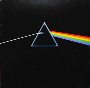
Perhaps the most recognisable image associated with Pink Floyd is also one of their simplest. Against a black background, a narrow beam of white light enters a triangular prism and emerges as a spectrum of colour. There are no photographs of the musicians, no elaborate illustrations and no album title on the original front cover.
The design emerged from Hipgnosis, with graphic artist George Hardie responsible for its finished illustration. Its origins were closely connected to the band’s desire for something different from the elaborate photographic concepts the studio had become known for.
Richard Wright encouraged the designers to pursue a cleaner, more precise approach. Thorgerson and Powell subsequently recalled encountering imagery involving the refraction of light, although their accounts differed in the precise details of the inspiration.
The concept appealed partly because light was already central to Pink Floyd’s concert performances. The prism offered a simple way to connect that visual identity with an image that was both scientific and mysterious.
Hardie’s execution gave the design its extraordinary clarity. Three basic elements — a beam, a prism and a spectrum — created an instantly recognisable composition.
Yet its simplicity also encouraged interpretation. The separation of white light into different colours might suggest transformation, fragmentation or the discovery of something concealed within an apparently unified whole. Such readings resonate with the album’s exploration of human experience, even though the artwork was not intended as a literal illustration of every song.
The design’s effectiveness lies in its ability to communicate without explanation. It works as an independent piece of graphic art while remaining inseparable from the album it represents.
Wish You Were Here (1975): The Art of Absence
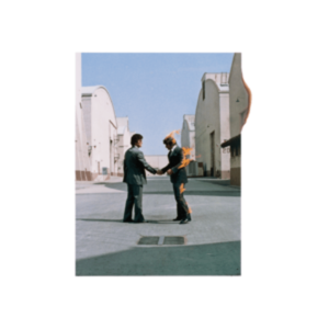
If The Dark Side of the Moon demonstrated the effectiveness of minimalism, Wish You Were Here revealed Hipgnosis’s talent for creating surreal images that appeared almost believable.
The album’s famous front-cover photograph shows two businessmen shaking hands on a studio lot. One is engulfed in flames, while the other continues the exchange as though nothing unusual is happening.
Aubrey Powell photographed the scene at the Warner Bros. studios in California, using professional stunt performers and specialist safety equipment.
The image transforms the familiar idea of being burned by a business deal into a disturbing physical event. A gesture normally associated with agreement and trust becomes a symbol of dishonesty and exploitation, reflecting the album’s concerns with the music industry and the breakdown of genuine human connections.
But the burning businessman was only one part of a much broader visual concept.
Elsewhere in the packaging, a faceless salesman stands in a desert, a diver enters a lake without disturbing its surface, and a woman’s figure is obscured by a veil. These images explored absence through different visual contradictions, presenting people or actions whose expected presence or consequences seemed to have disappeared.
The photographs were also associated with the four classical elements: fire, earth, water and air.
Hipgnosis extended the idea further by concealing the record inside opaque black shrink-wrap. A circular sticker featuring mechanical hands and the album’s identifying information appeared on the outside, while the artwork itself remained hidden until the packaging was opened.
This was an unusually bold decision for a major release. Rather than displaying the cover to attract attention in record shops, Pink Floyd deliberately concealed it.
The packaging turned the album’s central theme into a physical experience. Before hearing a note of music, the listener encountered an object defined partly by what could not be seen.
Animals (1977): A Pig Above Battersea
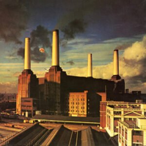
The cover of Animals presents one of the most extraordinary images in Pink Floyd’s catalogue: Battersea Power Station beneath a threatening sky, with a large inflatable pig suspended between its chimneys.
Unlike several of the band’s earlier sleeves, the central idea came from Roger Waters rather than Hipgnosis.
Waters was drawn to the imposing architecture of the London power station, which provided an appropriate setting for an album concerned with power, class and social hierarchy. The pig connected directly to the record’s portrayal of greed and corruption.
Turning the concept into a photograph, however, proved considerably more difficult than expected.
In December 1976, Hipgnosis organised a three-day shoot involving a roughly forty-foot helium-filled inflatable pig, later known as Algie. The intention was to photograph the balloon floating above the building, creating the surreal scene using a real object.
On the first day, the pig took so long to inflate that the photographers were unable to capture the intended image. They photographed the power station itself, while a marksman remained on standby in case the balloon escaped.
The following day, the pig broke free from its moorings and drifted away. Unfortunately, the marksman had not been rehired, leaving the balloon to continue its unexpected journey before eventually coming down in Kent.
The team returned for a third day and successfully photographed the pig above the building. The finished cover combined the preferred photograph of Battersea Power Station from the first day with an image of the balloon taken on the third.
The result is effective because it places something absurd within a recognisable industrial landscape.
Battersea’s enormous chimneys and imposing architecture suggest institutional power, while the floating pig introduces an unsettling element that appears both ridiculous and threatening. The contrast gives the image a satirical quality without requiring a literal illustration of the album’s lyrics.
It also demonstrates how important location could be to Pink Floyd’s artwork. The power station is not simply a background; its architecture contributes directly to the meaning of the image.
The Wall (1979): A Blank Surface Becomes a Nightmare

After the elaborate photography of Animals, Pink Floyd took an almost confrontationally simple approach to The Wall.
The original exterior sleeve featured little more than a pale brick wall. Roger Waters conceived the central idea, while illustrator Gerald Scarfe developed the disturbing visual world associated with the album.
On early copies, the band and album title appeared on a separate transparent sticker rather than forming a permanent part of the printed front cover. The intention was to preserve the simplicity of the wall itself.
The design offered a direct representation of the emotional barriers at the centre of the album, but it also denied the viewer the familiar invitation of a conventional record sleeve.
Inside the packaging, however, Scarfe’s illustrations revealed a very different world.
His grotesque characters transformed the album’s psychological conflicts into exaggerated, often terrifying figures. The oppressive schoolmaster, overprotective mother, marching hammers and monstrous judge gave physical form to the forces shaping the protagonist Pink’s isolation.
Scarfe’s imagery was effective precisely because it rejected realism. Faces became distorted, bodies assumed impossible proportions and authority figures appeared both absurd and threatening.
These illustrations established a visual language that would extend into the live production and Alan Parker’s 1982 film adaptation.
The contrast between the restrained exterior and the disturbing imagery within is central to the artwork’s success. The wall initially appears empty and impersonal, but behind it lies an entire world of fear, memory and psychological conflict.
Few Pink Floyd projects demonstrate more clearly how visual art could become an essential part of musical storytelling.
A Momentary Lapse of Reason (1987): Seven Hundred Beds by the Sea
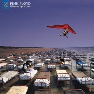
Following Roger Waters’ departure, Pink Floyd’s visual identity entered another period of change. For A Momentary Lapse of Reason, Storm Thorgerson returned to create one of the most elaborate photographic compositions associated with the band.
The cover depicts hundreds of hospital beds arranged across a vast beach, stretching into the distance beneath an expansive sky. The scene resembles an impossible dream, yet its most remarkable feature is that the beds were physically placed there.
Thorgerson’s concept was inspired in part by the reference to an empty bed in the song “Yet Another Movie”. Rather than illustrating a bedroom, he imagined a seemingly endless arrangement of beds extending across an open landscape.
The resulting photoshoot took place at Saunton Sands in Devon. Approximately 700 cast-iron hospital beds were transported to the beach and arranged in carefully positioned rows, each complete with bedding.
The undertaking required a substantial team, vehicles and considerable coordination. When rain disrupted the initial shoot, the installation had to be dismantled and recreated for a second attempt.
Photographer Robert Dowling captured the extraordinary scene, producing an image whose surreal quality depended upon the convincing detail of a real photograph.
The beds might suggest illness, vulnerability, dreams or emotional absence. Their repetition creates a sense of isolation, while the open beach contrasts sharply with the enclosed environments in which such objects would normally appear.
What makes the image particularly fascinating is the effort involved in achieving something that might initially appear to be a photographic illusion.
Thorgerson’s preference for creating surreal scenes in the physical world gave the artwork an unusual authenticity. The image looks impossible, yet the objects were genuinely there.
It was a striking continuation of Pink Floyd’s visual tradition at a time when the band itself was entering a new chapter.
The Artists Behind Pink Floyd’s Imagery
Although Storm Thorgerson is perhaps the name most closely associated with Pink Floyd’s album covers, the band’s visual identity emerged through the work of numerous designers, photographers, illustrators and filmmakers.
Their contributions were often collaborative, but the individuals involved brought distinctly different artistic approaches.
Storm Thorgerson and Aubrey Powell: The Creative Partnership Behind Hipgnosis
Storm Thorgerson’s approach to album design was rooted in a fascination with making the impossible appear real.
He favoured visual puzzles involving ordinary objects placed in extraordinary circumstances. Rather than illustrating a song directly, he wanted an image to provoke curiosity, encouraging viewers to question what they were seeing.
His personal connection with Pink Floyd helped establish an unusually productive creative relationship. The band was willing to consider ideas that might have seemed commercially impractical, while Thorgerson could pursue concepts that challenged expectations of what an album cover should look like.
Aubrey Powell was equally important to that process.
As Hipgnosis’s co-founder, Powell contributed creative ideas, photography and the practical expertise required to realise increasingly ambitious concepts. His work involved organising locations, performers and complicated shoots, but he was also instrumental in shaping the finished images.
The distinction between Thorgerson as the conceptual thinker and Powell as the practical photographer can be useful, although it risks oversimplifying a partnership built on shared creative decisions.
Hipgnosis’s work emerged through collaboration, discussion and experimentation, frequently involving additional photographers, designers and specialists.
The studio also worked with artists beyond Pink Floyd, including Led Zeppelin, Genesis and numerous other musicians. Its distinctive approach helped establish the album sleeve as a space for ambitious visual ideas rather than simply a promotional photograph.
George Hardie: The Precision Behind the Prism
Graphic designer George Hardie brought another set of skills to Pink Floyd’s visual identity.
While Hipgnosis was particularly associated with conceptual photography, Hardie’s expertise lay in graphic illustration and the precise execution of visual ideas.
His contribution to The Dark Side of the Moon demonstrates why that distinction matters. The prism’s effectiveness depends upon the clarity of its composition, the relationship between its geometric elements and the disciplined use of colour.
An imaginative concept does not automatically produce a memorable design. Hardie’s work helped transform a relatively straightforward idea into an image of extraordinary visual impact.
His contribution also demonstrates that Pink Floyd’s artwork was never dependent upon a single technique. Some of the band’s most enduring imagery emerged through simplicity and graphic precision rather than elaborate photographic staging.
Gerald Scarfe: Giving The Wall Its Nightmares
Gerald Scarfe brought a fundamentally different artistic sensibility to Pink Floyd.
Already established as a political cartoonist and satirical illustrator, Scarfe was known for drawings that exaggerated human features and transformed familiar figures into grotesque caricatures.
His association with Pink Floyd developed during the 1970s. He contributed caricatures to the band’s illustrated 1974 tour programme, and his animations subsequently became part of their 1977 concert presentations.
The collaboration reached its fullest expression with The Wall, where Scarfe’s artwork helped translate Roger Waters’ narrative of isolation and repression into a disturbing visual world.
Unlike Hipgnosis’s frequently ambiguous photographs, Scarfe’s imagery could be aggressively direct. His monstrous characters confronted audiences with exaggerated representations of authority, fear and emotional damage.
Animation also allowed him to explore transformations that conventional stage design could not achieve. Bodies could change shape, objects could become threatening and psychological experiences could acquire impossible physical forms.
His work became central to the album’s packaging, theatrical production and film adaptation, demonstrating how illustration could develop into an active part of musical storytelling.
Together, these artists gave Pink Floyd an unusually varied visual identity. Their approaches differed considerably, but each helped establish the idea that the imagery surrounding music could possess its own artistic value.
When Music Became a Visual Spectacle
Pink Floyd’s interest in visual art was never confined to album sleeves. As their audiences expanded, the band developed increasingly sophisticated ways of combining music with film, animation and theatrical design.
The experimental lighting of their psychedelic beginnings provided a foundation, but their later productions introduced visual elements that were more carefully coordinated with individual compositions.
The Circular Screen: Giving Music a Visual Dimension
One of Pink Floyd’s most recognisable stage features was the large circular projection screen, first used during their French tour in June 1974.
The screen, which became affectionately known as Mr Screen, provided a dedicated space for films and animation. Positioned behind the musicians, it created a visual focal point without requiring the performers themselves to dominate the stage.
Its circular shape distinguished the production from conventional cinema projection, while the specially prepared imagery could suggest the atmosphere or meaning of individual compositions.
Animator Ian Emes was among the artists whose work contributed to this developing visual language. His animated imagery, including sequences associated with “Time”, demonstrated how moving images could complement the structure and emotional character of Pink Floyd’s music.
The screen also offered a degree of visual freedom. A composition could be accompanied by abstract movement, recognisable imagery or carefully constructed sequences without requiring the band to interrupt the performance.
Rather than simply making concerts more spectacular, these projections introduced another layer through which audiences could experience the music.
The Wall: Turning Psychological Isolation into Theatre
Pink Floyd’s most ambitious fusion of music and visual storytelling emerged with The Wall, first performed live in February 1980.
The production transformed Roger Waters’ concept of emotional isolation into a physical theatrical experience.
Throughout the first half of the concert, stagehands gradually constructed a wall between the musicians and the audience. Large cardboard bricks accumulated across the stage until much of the performance was concealed behind an imposing barrier.
The symbolism was direct but remarkably effective. The wall represented the psychological defences built by the album’s central character, Pink, while its construction created a growing separation between performers and spectators.
Gerald Scarfe’s artwork gave the production much of its disturbing visual identity.
His grotesque characters appeared as enormous inflatables, while animated sequences were projected onto the completed wall. The schoolmaster, mother and other threatening figures became physical manifestations of the anxieties explored throughout the album.
The completed structure also functioned as a projection surface, allowing animation to dominate the audience’s view. At certain moments, the musicians were almost entirely displaced by the visual narrative.
When the wall finally collapsed near the conclusion, the destruction carried dramatic significance because audiences had witnessed its construction throughout the performance.
This distinguished The Wall from a conventional concert featuring elaborate effects. The stage design was inseparable from the story being told, transforming psychological isolation into something the audience could physically see.
The Division Bell Tour: Spectacle on a Stadium Scale
Following Roger Waters’ departure, Pink Floyd’s live visual presentation continued to evolve under David Gilmour’s leadership.
The 1994 tour supporting The Division Bell brought together elaborate lighting structures, lasers, film projections and enormous stage installations, creating a visual environment designed for stadium audiences.
The familiar circular screen remained central to the production, displaying films and animated sequences coordinated with the music. By this stage, developments in lighting and projection technology allowed for increasingly precise and sophisticated presentations.
Yet the most effective moments were not necessarily the most elaborate.
During atmospheric compositions, restrained lighting and carefully chosen imagery could create a sense of intimacy within an enormous venue. Elsewhere, dramatic changes in colour, movement and scale heightened the impact of the music.
This contrast helped prevent the production from becoming an uninterrupted display of special effects.
The tour’s final performances at London’s Earls Court were documented for the live album and concert film Pulse, released in 1995. These recordings preserved the visual character of Pink Floyd’s final major tour alongside the musical performances.
Although the production differed considerably from the narrative-driven approach of The Wall, it demonstrated how the band’s visual ideas could adapt to a different concert environment.
From improvised psychedelic projections to carefully coordinated stadium productions, Pink Floyd’s performances reflected a continuing interest in what imagery could contribute to music. The scale changed dramatically, but the ambition to create a unified experience remained.
Pink Floyd on Film and in Exhibitions
Pink Floyd’s visual identity also extended into cinema and museums, where their music and imagery could be experienced outside the conventional concert environment.
These projects revealed different possibilities for visual interpretation. A deserted Roman amphitheatre became the setting for an unconventional performance film, a concept album developed into a disturbing cinematic narrative, and decades of artwork were eventually assembled for a major museum exhibition.
Live at Pompeii: A Concert Without an Audience
When director Adrian Maben developed Pink Floyd: Live at Pompeii, he approached the concert film from an unusual perspective.
Rather than documenting a performance before an enthusiastic crowd, he wanted to capture the band playing in an environment where the music and surroundings could command the viewer’s attention.
The resulting film, first released in 1972, featured Pink Floyd performing in the ancient Roman amphitheatre at Pompeii, with Mount Vesuvius visible in the surrounding landscape.
There was no conventional audience. Instead, the musicians performed amid the ruins, surrounded by weathered stone and the remains of a civilisation devastated by a volcanic eruption nearly two thousand years earlier.
The setting created a striking contrast. Pink Floyd’s experimental music, with its electronic textures and extended instrumental passages, unfolded against architecture that seemed almost impossibly ancient.
Maben’s direction made the location essential to the experience. Wide shots emphasised the emptiness of the amphitheatre, while close-ups captured the musicians concentrating on their instruments.
The absence of spectators allowed the film to move between the scale of the landscape and the intimate details of the performance.
Not all the musical sequences were filmed at Pompeii. Additional performances were recorded in a Paris studio, while later expanded versions incorporated footage of Pink Floyd working on The Dark Side of the Moon at Abbey Road.
These additions offered a broader perspective on the band’s creative process, but the film’s defining imagery remained the performances among the ancient ruins.
Live at Pompeii is particularly distinctive because its visual ambition came largely from what was absent. Without a crowd or elaborate stage production, the location itself became the spectacle, allowing the music to occupy an unfamiliar and haunting environment.
Pink Floyd – The Wall: Bringing a Concept Album to the Screen
Where Live at Pompeii avoided conventional storytelling, the 1982 film Pink Floyd – The Wall embraced it.
Directed by Alan Parker, the film adapted Roger Waters’ concept album into a largely dialogue-free narrative combining live action, music and Gerald Scarfe’s animation.
The story follows Pink, a troubled rock musician whose experiences of childhood trauma, authoritarian education, personal loss and emotional isolation contribute to the construction of a psychological wall separating him from the outside world.
Translating such an internal narrative into cinema presented an unusual challenge. Much of the album concerns memories, fears and emotional experiences that cannot easily be represented through realistic action.
The film’s solution was to move between different visual styles.
Live-action sequences depict Pink’s increasingly isolated existence, while Scarfe’s animations transform psychological conflicts into grotesque and often nightmarish imagery.
During “Goodbye Blue Sky”, images of war and destruction unfold through Scarfe’s unsettling visual language, communicating the emotional consequences of conflict without relying on conventional dialogue.
Elsewhere, the marching hammers become a powerful symbol of conformity and authoritarian control. Their mechanical movements and identical appearance create an image of collective oppression that is both disturbing and immediately recognisable.
Bob Geldof’s performance as Pink provides the human centre of the film, but the visual storytelling frequently takes precedence over conventional character development.
The result is neither a straightforward concert film nor a traditional musical. Instead, the music forms the foundation of a cinematic experience that moves between memory, fantasy and psychological horror.
Cinema also allowed Scarfe’s artwork to develop beyond the limitations of album packaging and live performance. Through movement, editing and animation, his characters could undergo elaborate transformations that made the psychological narrative more immediate.
The film can be deliberately uncomfortable, but that intensity is central to its purpose. Rather than simply illustrating the songs, its imagery confronts viewers with the emotional and political anxieties embedded within them.
Their Mortal Remains: Pink Floyd Enters the Museum
In 2017, Pink Floyd’s visual legacy received a different kind of recognition when the Victoria and Albert Museum in London opened Pink Floyd: Their Mortal Remains.
The exhibition brought together decades of album artwork, concert design, instruments, photographs and archival material, presenting the band’s history through the relationship between music and visual culture.
Unlike a concert or film, the museum setting allowed visitors to examine objects that had previously been encountered only as part of a finished recording or larger performance.
Original artwork and design materials revealed the creative processes behind familiar images, while stage props and production elements demonstrated the physical scale of the band’s theatrical ambitions.
The exhibition also highlighted the importance of collaboration. Designers, illustrators, photographers, filmmakers and technicians were recognised as contributors to Pink Floyd’s identity rather than simply as people supporting the musicians.
This offered a different perspective on artwork that can appear deceptively simple in its finished form. A familiar album sleeve might have emerged from numerous sketches, discussions, photographic experiments and practical decisions that remain invisible to the listener.
Displays associated with the band’s concert productions, including material from The Wall, also demonstrated how visual ideas originally designed for large performance spaces could be preserved and interpreted in a museum.
The exhibition concluded with an immersive audiovisual presentation of “Comfortably Numb”, reconnecting the displayed objects with the music that had inspired them.
By placing Pink Floyd’s creative work within a major museum devoted to art and design, Their Mortal Remains encouraged visitors to consider album covers, stage productions and concert films as significant examples of visual creativity.
It also revealed the extraordinary amount of experimentation and technical problem-solving behind images that audiences had come to recognise almost instinctively.
Why Pink Floyd’s Visual Art Still Matters
Decades after their creation, Pink Floyd’s most recognisable images continue to exist far beyond the albums they were designed to accompany. The prism from The Dark Side of the Moon, the burning businessman from Wish You Were Here and the floating pig from Animals have become cultural symbols in their own right.
Yet their enduring appeal lies in more than familiarity. These images rarely offered straightforward explanations of the records they represented. Instead, they encouraged curiosity, allowing listeners to discover connections between the artwork and music for themselves.
That philosophy extended into Pink Floyd’s concerts and films, where visual ideas could establish atmosphere, communicate psychological conflict or become essential to the storytelling itself. The band’s willingness to collaborate with artists of different backgrounds gave their visual identity an extraordinary range of styles and approaches.
What makes Pink Floyd’s artistic legacy so distinctive is that the imagery never depended on a single formula. A simple geometric design could be as effective as an elaborate photographic installation, while a disturbing animation could express something the music alone left open to interpretation.
For Pink Floyd, the relationship between sound and vision was an opportunity to explore ideas from different perspectives. Their greatest images did not tell listeners what to think about the music. They gave them something else to think about.